
Featured in jetc.dev.
A few weeks ago, I gave a talk at the Mobile Notts meetup where I spoke about how we at Cuvva are migrating our design system to Jetpack Compose, what we learnt and how you can do the same.
It was a fun talk which touched on a lot of content, and I’ve had quite a few people ask about a video. Sadly there isn’t one (although I may give the talk again), but there’s so much to cover that I decided to make a series of posts about it with more detail and examples.
In this series I intend to talk about how we planned our migration, the steps we took both practically and from a team perspective, and talk candidly about the roadblocks we found and experience that we had. Hopefully you’ll be able to take away some of the hard-won learnings that we earned and apply it to your own teams as you start thinking about migrating to this extremely exciting technology.
For those skipping ahead, you can find part two here.
In part one
I’ll cover:
- What problems did we have with our design system?
- What problems did we think Compose would solve?
- Creating a test platform to mitigate risk
- How to get your team involved and what resources we used
Later in the series, I’ll talk in more depth about creating a custom theme and design system, how we further attempted to prevent large changes around rapidly changing APIs, how interop works, and about testing and metrics.
That’s a lot. For now, let’s jump into part one.
Our design system
A design system is a collection of reusable components, guided by clear standards, that can be assembled together to build any number of applications
At Cuvva we have invested heavily in a coherent design system across the entire company, with the intention being that once these components are created, it becomes very simple to rapidly build new feature screens. Anyone designing or building pages should be very clear what is and isn’t a “top-level” component, how interactions with these components work, how they react to dark mode etc.
For us, this was built upon several key areas:
- A strong design spec, with “top-level” components and subcomponent variations, semantic colours (i.e.
background, notwhite) and interaction guidelines - A library of these design components built using custom
Viewclasses - Heavy investment in modularisation, so that each component is in its own Gradle module and doesn’t pull in any unwanted dependencies
- A design app to host all this information in, to act as a showcase and a bridge between design & development, and for rapid iteration
Here we have an example of the most primitive components in the design system - “tokens”. This includes typography, colours, illustrations and icons, and are the smallest unit of the system:
| Typography | Semantic colours |
|---|---|
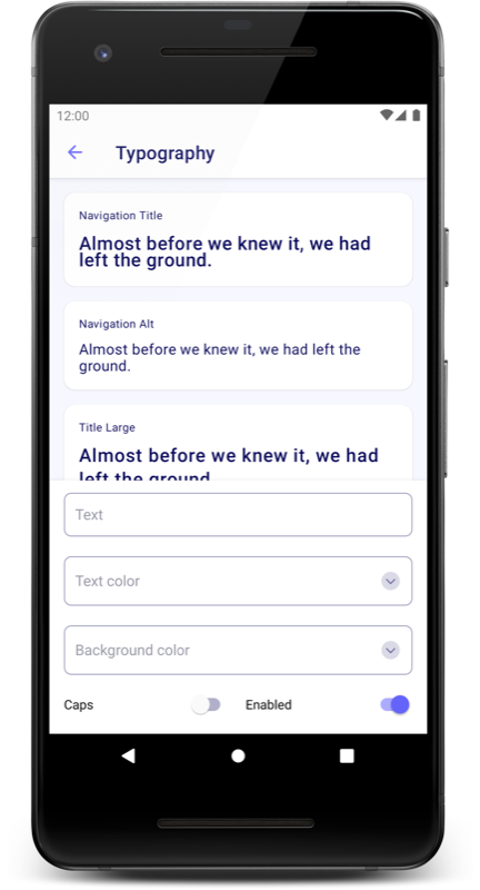 |
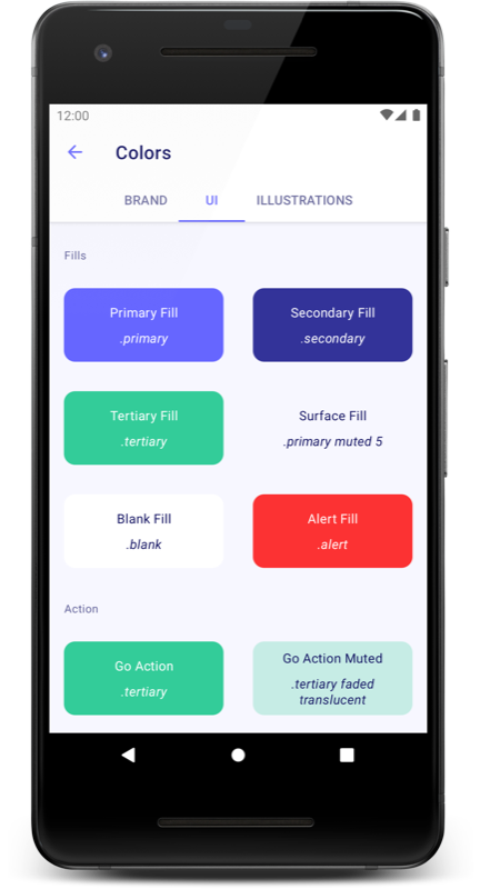 |
Going a level up, we have what we call “primitive components” - these are the most simple View objects, typically a Button, Icon with a click listener or some other single responsibility piece. As you can imagine, these are used all over the app:
| ButtonView | ListHeader |
|---|---|
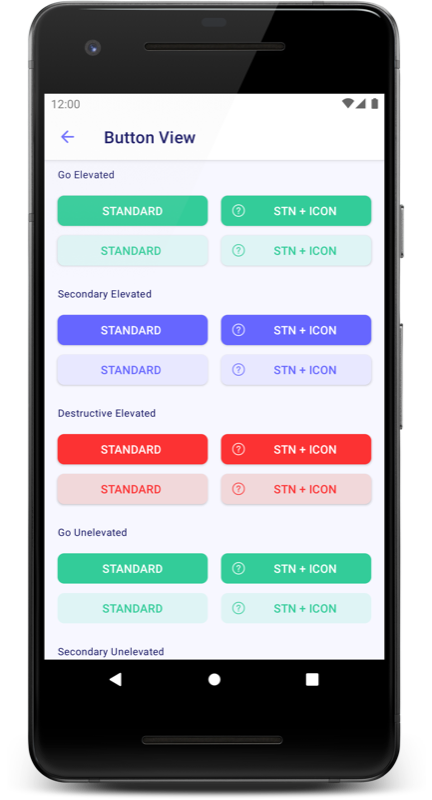 |
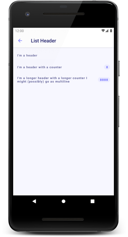 |
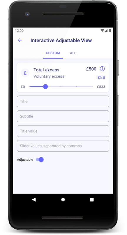
One more level up and we come to “compound components”. These are typically used a lot less and may even be only used in one specific feature. These are as the name suggests, built up of collections of primitive components:
| AdjustableView | SubmissionView |
|---|---|
 |
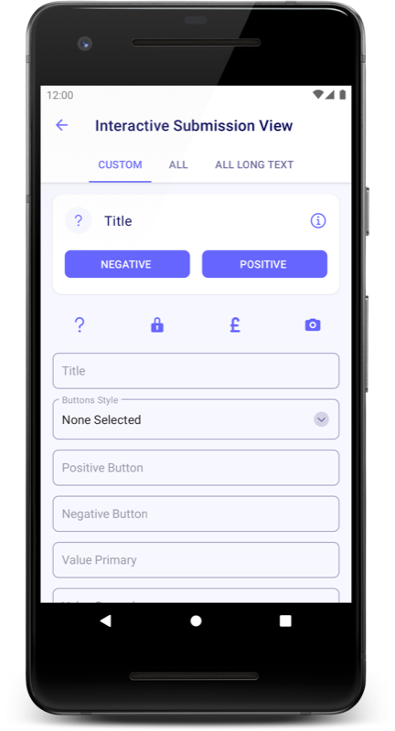 |
As you can tell, these are somewhat harder to name.
The motivation to migrate
So far so good. We have reusability, a great catalogue of components, and well defined colours and typography. Now, let’s take a peek at how ButtonView was made:
class ButtonView @JvmOverloads constructor(
    context: Context,
    attrs: AttributeSet? = null,
    defStyleAttr: Int = 0,
    defStyleRes: Int = 0
) : FrameLayout(context, attrs, defStyleAttr, defStyleRes) {

    enum class Mode {
        GO_ELEVATED,
        GO_ELEVATED_MUTED,
        SECONDARY_ELEVATED,
        SECONDARY_ELEVATED_MUTED,
        DESTRUCTIVE_ELEVATED,
        DESTRUCTIVE_ELEVATED_MUTED,
        GO_UNELEVATED,
        GO_UNELEVATED_MUTED,
        SECONDARY_UNELEVATED,
        SECONDARY_UNELEVATED_MUTED,
        DESTRUCTIVE_UNELEVATED,
        DESTRUCTIVE_UNELEVATED_MUTED,
        OUTLINED,
        TEXT
    }
    // ...
}
Yeah, okay. This is kind of nasty. Probably the worst thing about this is that this custom View must respond to state changes and be able to switch its theme dynamically, which involves removing View objects from the parent ViewGroup and then inflating new ones with a ContextThemeWrapper and inserting them into the parent.
There’s also dozens and dozens of lines of ThemeOverlay declarations for both day and night mode.
The end result
Ultimately the design system fulfils its purpose - once we have these components it’s extremely quick to get a new screen up and running.
However, it’s clear from the example of the ButtonView that actually creating these components is pretty tedious and scary. Plenty has been said about how complex and error-prone the Android theming system is so I won’t dig into it too much here, but it was definitely painful for us to utilise and there’s probably only one member of the team who understands the setup fully. Bill Phillips at Cash App wrote an excellent breakdown of why themes are flawed here, which explains it better than I ever could.
We also found that our build times had really gotten out of hand. This is largely our own fault - we invested heavily in DataBinding and each custom View defined its own DataBindingAdapter so that we were able to pass state via XML. This takes advantage of KAPT, and we decided that we wanted to move away from it as much as possible (admittedly, we also lean on both Dagger and Moshi heavily, which also use KAPT. However, Moshi KSP is already available, and Dagger KSP is coming at some point).
It looked to us that Jetpack Compose would solve these issues with typesafety, reducing our reliance on KAPT and a much easier API for building completely custom components - not to mention removing state from our views and easy integration with our Flow-based MVI architecture. Migration would give us a chance to overhaul our design system, re-think how we interact with the design team and improve our testing setup.
But this would be an enormous job - we have 44 custom components and over 500 XML layouts, and Compose was and still is in alpha. How would we go about migrating in a safe and predictable way?
Step one: a safe playground
As I’ve mentioned above, we were lucky in that we’d already invested in building a separate design app. This app, titled Aegis, is distributed separately from the main Cuvva app and anyone in the company can download it to play with all of our components. This has a number of distinct advantages:
Separation of concerns
When writing our custom View classes, we aim to make them as lightweight as possible. This means not pulling in any extraneous dependencies - for instance, no View should be aware of domain classes or logic, or should do anything other than render the information that’s fed to it. Having a separate design app helps enforce this - it should be fairly obvious if you include something you shouldn’t.
Compose Desktop also has some interesting implications here - if you keep your design code separated enough, could you distribute a design desktop app? When iOS support eventually drops, could you re-use the Android design system on iOS too? The potential advantages are so great that I would strongly recommend keeping new design system modules completely free of any Android implementation details (i.e. String resources, Context, or any domain logic) and making them Kotlin Multiplatform compatible by default.
Viewing all permutations
As you can see in the screenshots above, we aim to display every permutation of each View. This is handy for checking how each component responds to things that you might not normally consider such as extremely long text.
Rapid iteration
Building a component in-place in your app can be quite tedious, as you may have to step several pages into a flow that’s hard to reproduce just to be able to see your new component. Add to that the build times of your main app, and suddenly your feedback loop is very long. Having a design app which only features view components gives you a much shorter loop, and it ends up being far faster to work on these components.
A Compose playground
This is the big one. With sensible modularisation, a design app gives you a place where you can consume Compose code at no risk to your main app, and it allows you to work on migrating core sections of your design system across to Compose without affecting your main app. It gives your team a safe place to experiment with non-production code, and then once you’re all happy, you can consume these newly created modules in prod.
Here’s a simplified version of what our design modularisation looks like:
It would seem obvious that you might add Compose code in :design-core and consume it, but there’s a risk to your main app:
The experimental nature of Compose and the compiler backend that makes it work makes this kind of setup rather risky. Firstly, you must use the alpha version of the Android Gradle Plugin. Secondly, Composable modules must use the new IR backend, and modules which enable this cannot be consumed by other modules unless they also enable IR (-Xuse-ir) or enable IR dependencies explicitly (Xallow-jvm-ir-dependencies). This may or may not play nicely with existing plugins in your main app, so it’s best to keep these separate for now:
For us, we ran into the issue where Compose was incompatible with kotlin-android-extensions, and keeping this separation allowed us to keep building in Compose whilst removing the plugin at our own speed in the main app.
One advantage of this setup is that it prevents you from consuming existing design system code in your new Compose setup - giving you a completely fresh start. The other significant advantage is that you can keep using the stable build of Android Studio for the app that pays the bills, whilst only requiring the alpha versions for the far-less-critical design app. It really de-risks a large part of the migration.
If you haven’t yet created a design app I would strongly recommend that you do this before starting any kind of Compose exploration. The advantages are just too great not to, and the cost in terms of setup is minimal. If you’re not able to pull out existing design components from your app, you can keep this 100% Compose and still reap the benefits.
Step two: the team kick-off
Because you’re here, reading this article, chances are you’re more experienced with Compose than most. However while the framework is the hot new thing in the Android world, the chances are most of your colleagues haven’t written a single line of code yet. It’s easy to forget that not everyone plays with cutting-edge tech in their spare time - infact I would guess the majority of people don’t, and that’s totally fine. They might have read some articles, they might have watched a video or two, but that’s probably about it. This makes any discussions about how to handle a migration internally pretty academic, and we found a good solution in a hack day.
This idea was borrowed from Jossi and the team at Snapp Mobile, who’ve written a great blog about the experience. We thought this was a brilliant idea, and so we setup a hack day so that the team could get dedicated time to get to grips with Compose.
Resources
The first step was to pool together some resources - articles that we’d found useful which explain core concepts, or code workshops for getting up and running quickly. Some of the resources we shared included:
- The Compose Pathway. Specifically, we found part 1, 2 and 6 the most useful for hitting the ground running quickly
- The Compose Samples were great to use as a reference, and in particular we found that JetSnack had a great example of a custom design system
- Compose by example is an excellent video by Nick Butcher which again goes into design system specifics
- SunFlower was useful as a reference for interop
- Compose Playground is useful for quick summaries of lots of components
- The Compose state docs are great for those who already have the basics down and want to dig in a bit deeper into how you manage state in Compose
- Those feeling adventurous had the option of getting stuck into this great animation tutorial at Ray Wenderlich, although I believe this information is out of date now due to the new suspending animation APIs
The schedule
Next, we put all of this information into a Google Doc with information about the day’s schedule, which was roughly this:
- In the morning, everyone goes their separate ways and reads as many of the resources as they feel the need to
- At midday, we regroup, chat briefly about interesting things that we’ve discovered
- We spend the afternoon hacking and building stuff. Pair programming is incredibly useful here, and I’d also recommend the most experienced member of the team keeping a Hangout call open all day that others can drop in and out of when they get stuck
- The next morning we do a show-and-tell, and then spend an hour or so debriefing, discussing what we liked, what we didn’t, any concepts we got stuck on and how we might see Compose integrating into the app. This debrief resulted in some really fascinating conversations about API design, how permissive we should make our components and all sorts of other topics.
The result
This worked super well for us. Those who hadn’t played with Compose yet really enjoyed it and understood why the others were so excited, and those who had got to cement their knowledge further in helping others. We found that it really energised the team and I can’t recommend doing a hack day enough.
One thing I would say is to lower your expectations for the day - Compose is a totally new paradigm which takes a lot of getting used to; and managing to create a counter that increments on a button click is a really good achievement for the day. Don’t let anyone on the team fool themselves into thinking they’ll create some amazing clone of some clever UI: be realistic about what you think is achievable.
For anyone who is interested, I’m more than happy to share this doc. Reach out to me on Twitter.
In part two
That’s it for now. Next time, I’ll discuss how we ported our theme across, how we abstracted over the existing Compose APIs, and about some of the discussions we had around API design.
Thanks for reading and please feel free to reach out if you have any questions.