
Welcome back to the second article in my series about migrating design systems to Jetpack Compose, where I talk about our experiences at Cuvva and how you can apply what we learnt to your team. In part one, I talked about planning ahead, modularisation and getting your team onboard.
In part two, I’ll talk about custom theming, about building ontop of existing APIs, how to minimise risk from relying on a rapidly changing library and pose a question about API design.
Building a custom theme
When you start putting pen to paper (or should that be fingers to keys?), your theme is the most fundamental component of your entire design system - there’s not much point starting to build any Composables until you’ve got your colours, typography etc in place.
The theming system in Compose is quite simple, far more so than the legacy XML way of doing things. It has pretty sensible defaults which will work well for a lot of usecases, but as consumers or maintainers of an existing design system, you will likely find it a bit limiting. A typical theme is declared as such, where we invoke the lightColors and darkColors factory functions to create our colour palettes for our theme:
@Composable
fun MyTheme(
    isDarkTheme: Boolean = isSystemInDarkTheme(),
    content: @Composable () -> Unit
) {
    val myColors = if (isDarkTheme) lightColors(...) else darkColors(...)

    MaterialTheme(
        colors = myColors,
        content = content,
        typography = Typography,
        shapes = Shapes
    )
}
Under the hood, these functions both create instances of a Colors class, which features sensible semantic colour names for a basic theme that adheres to the Material spec.
val lightPalette = lightColors(
    primary = // ...,
    primaryVariant = // ...,
    onPrimary = // ...,
    secondary = // ...,
    secondaryVariant = // ...,
    onSecondary = // ...,
    onSurface = // ...,
    onBackground = // ...,
    error = // ...,
    onError = // ...
)
These colours are then consumed by Composables in the androidx.compose.material package. For example, here’s a simple Card where the background is sensibly set to use the surface colour property:
@Composable
fun Card(
    modifier: Modifier = Modifier,
    shape: Shape = MaterialTheme.shapes.medium,
    backgroundColor: Color = MaterialTheme.colors.surface,
    contentColor: Color = contentColorFor(backgroundColor),
    border: BorderStroke? = null,
    elevation: Dp = 1.dp,
    content: @Composable () -> Unit
) {
    // ...
}
This is great, it’s easy to use and makes a tonne of sense. However, chances are your design system doesn’t fit neatly into this pre-defined set of semantic colours, and you’ll need to go about building something a whole lot more custom. Thankfully, it’s quite easy to do.
Custom colours
Step one is to model your semantic colours in a new data class; here’s a snippet of how we model ours:
val lightPalette = CuvvaColors(
    primaryFill = // ...,
    primaryFillFaded = // ...,
    secondaryFill = // ...,
    secondaryFillFaded = // ...,
    tertiaryFill = // ...,
    tertiaryFillFaded = // ...,
    surfaceFill = // ...,
    surfaceFillFaded = // ...,
    accentFill = // ...,
    accentFillFaded = // ...,
    blankFill = // ...,
    blankFillFaded = // ...,
    alertFill = // ...,
    alertFillFaded = // ...,
    // ...
)
Straight away you can see it’s a lot larger; in total I think we have around 25 semantic colours, which is a lot. Your theme may be more complex or more simple, but the same techniques will apply here.
The next question is how do you fit this new class into the MaterialTheme object? The answer is you don’t - but if you dig into the underlying implementation it becomes pretty clear what to do. You’re going to have to use an Ambient to provide your colours yourself.
What on earth is one of those?
The name doesn’t give a tonne away, but it makes sense once you realise what it does. If you were naively attempting to provide something like colours to other Composables in your app, you could do it a couple of different ways.
The first way would be to simply pass the colours from the top of your tree to the bottom through function parameters. Even just thinking about this makes me tired, so it’s not a particularly good approach.
The second would be to just make your colours an object that everyone is able to access globally. This would indeed solve the tedious parameter-passing problem, but it throws up another by virtue of being global. With a solution like this, you’re unable to mix and match themes.
Let me explain with an example. In Compose, you’re able to create multiple themes and wrap different sections of your UI and have these sections inherit colours from their nearest theme. For the sake of a demo, I’ve created two themes - PurpleTheme and TealTheme. All these do is they set their surface colour to either purple or teal.
PurpleTheme {
    Column {
        Surface(color = MaterialTheme.colors.surface) {
            Text("Purple theme!")
        }

        Spacer(modifier = Modifier.padding(16.dp))

        TealTheme {
            Surface(color = MaterialTheme.colors.surface) {
                Text("Teal theme?")
            }
        }
    }
}
In this extremely contrived example, you’d expect to see this:
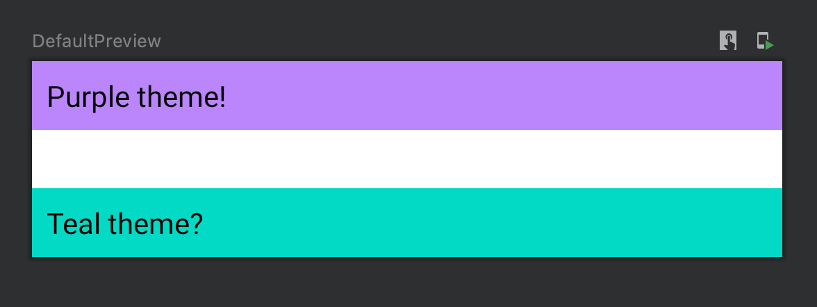
But you don’t, because your theme is declared globally. This is the problem that an Ambient solves. It’s basically a service locator that works on a per-tree basis - i.e., you can ask for SomeTheme.colors.somethingSpecific, and Compose will look up the tree for the nearest AmbientProvider. In my extremely simple example, the bottom Surface is wrapped in TealTheme, and therefore grabs the teal version of surface. Everything else further up the Composable tree is unaware of TealTheme, and simply inherits its surface from PurpleTheme.
It turns out this system is super powerful, but we’ll go into that later.
Back to the design system
So, if you want to provide your custom colours to your theme, it’s simple enough. Here, we create a CuvvaTheme object that we access instead of MaterialTheme, which has a Composable property colors. This property then delegates to our AmbientCuvvaColors property.
object CuvvaTheme {

    @Composable
    val colors: CuvvaColors
        get() = AmbientCuvvaColors.current
}

private val AmbientCuvvaColors = staticAmbientOf<CuvvaColors> {
    error("No CuvvaColors provided")
}
This property invokes staticAmbientOf and simply passes an error message; one that you’ll find in a Throwable should you forget to tell Compose how exactly to actually provide these colours. The actual providing part is simple:
@Composable
fun CuvvaTheme(
    darkTheme: Boolean = isSystemInDarkTheme(),
    content: @Composable () -> Unit
) {
    val customColours = when (darkTheme) {
        true -> CuvvaDarkPalette
        false -> CuvvaLightPalette
    }

    Providers(AmbientCuvvaColors provides customColours) {
        MaterialTheme(
            colors = debugColors(),
            shapes = Shapes,
            content = content,
        )
    }
}
This looks a bit odd - we’ve wrapped the old MaterialTheme inside our Providers function. This is so that the rest of the MaterialTheme properties are still available to us - we don’t need to override shapes, so we’re happy to just use the defaults that come with MaterialTheme.
That’s really it - we’re now able to access our semantic colours like so:
setContent {

    CuvvaTheme {
        Surface(
            color = CuvvaTheme.colors.goAction,
            // ...
        )
    }
}
Thanks to Google and the devrel team for providing a great demo implementation here in the JetSnack repository - this was incredibly helpful for us.
Preventing gotchas
You might have noticed in MaterialTheme that we’ve set colors to debugColors(). This is a really useful debugging tool. All debugColors() does is provide a Colors class where everything is set to something obnoxious and obviously not in our theme so that it’s incredibly easy to spot when we’re using our theme incorrectly. Going back to our Card example:
@Composable
fun Card(
    modifier: Modifier = Modifier,
    shape: Shape = MaterialTheme.shapes.medium,
    backgroundColor: Color = MaterialTheme.colors.surface,
    contentColor: Color = contentColorFor(backgroundColor),
    border: BorderStroke? = null,
    elevation: Dp = 1.dp,
    content: @Composable () -> Unit
) {
    // ...
}
If you forget to replace MaterialTheme.colors.surface with MyCustomTheme.colors.surface, you’ll immediately be able to see it, because in our case it’ll be bright magenta.
One slight gotcha that we spotted early on - here’s a snippet of the androidx.compose.material Text Composable:
@Composable
fun Text(
    text: String,
    modifier: Modifier = Modifier,
    color: Color = Color.Unspecified,
    // ...
)
Notice Color.Unspecified. This is interesting because it doesn’t inherit from any particular theme, so it’s quite difficult to spot when you’ve accidentally forgotten to set color to the correct one for your design system. The simple solution here is to wrap Text in your own Composable function and don’t let consumers of your API set the colour themselves.
A brief note on Ambients
Going back to the Ambient concept briefly: this is a super powerful idea, and it’s not limited to colours. We also provide our own typography the same way, but there’s quite a few possibilities here.
One thing we’ve considered recently (which may end up being the topic of its own short article) is using an Ambient to provide strings on a per-layout basis. The rationale behind this is that using the built-in stringResource function is an implementation detail of the Android platform and if you’re aiming for eventual multiplatform support, it’s no bueno to litter your UI with it. Using an Ambient, you could provide these strings on a per-platform basis and then make them available to all nodes in your UI tree, without tying your UI to Android specifically.
We’re just scratching the surface here I suspect, and I’m sure that some exceptionally creative people are going to do some very cool things with them.
Creating components & mitigating risk
Now that you’ve created your custom theme, it’s time to start consuming it. In this simple example, we’re invoking a Text Composable and setting our own colour:
CuvvaTheme {
    Text(
        color = CuvvaTheme.colors.goAction,
        // ...
    )
}
This is fine but you don’t want to be doing this all the time as it’s easy to forget, so it makes sense to create an abstraction over the top:
@Composable
fun GoActionText(
    modifier: Modifier = Modifier,
    text: String
) {
    Text(
        color = CuvvaTheme.colors.goAction,
        // ...
    )
}
And there you have it: your first Composable design component. On the face of it this isn’t a staggering achievement, but adding a layer of abstraction over the top has a couple of interesting implications.
Preventing misuse
You’ve hardcoded the colour to something from your theme, now it’s much more difficult for consumers of your API to do something incorrect with it. You’ll probably want to provide multiple variations of Text which raises questions about discoverability and a few other things that we’ll discuss, but now you have an actual library of components. This is great.
Hiding implementation details
As developers, we tend to go out of our way to hide implementation details and that’s exactly what we’ve done here. How exactly GoActionText works under the hood is now irrelevant to callers, and it enables you to make changes to the underlying Composable without affecting consumers. In this basic example we rely on the androidx.compose.material version of Text, but we may in the future decide that we want to drop down a level of abstraction for more control and consume the androidx.compose.foundation implementation, BasicText, instead.
This also has a great side-effect:
Mitigating risk
By providing a level of abstraction above material or foundation or whatever you choose, you’re also making your life easier when Compose inevitably changes. The API surface will change (such is the risk of alpha software) and will introduce breaking changes, but there’s also simple, annoying changes like moving packages which could end up affecting every single page that you’ve worked on if you’re leaking implementation details all over the place. These simple abstractions act as a facade pattern over the top and minimise the number of changes that need to be made when the Compose APIs change, and at this early stage of adoption the benefits are absolutely huge.
You’re not going to be able to facade all Compose classes, but hiding material or foundation would be a big win.
On abstractions
Nick Butcher goes into this in his excellent video Compose by Example, which I encourage you check out.
Compose is built in layers that provide higher-level abstractions over the previous layer. runtime provides primitives for actually running Composables, ui provides models such as AnnotatedString and TextStyle. foundation provides usable Composables such as BasicText, and then material gives you implementations that adhere specifically to the Material Design spec. This is wonderfully powerful, and you can choose to build your design system ontop of material, foundation, or you can choose to drop down a layer further if you really need to.
What’s better is that you don’t have to decide this globally, you can do it on a component-by-component basis, choosing to build ontop of material for the buttons, whilst utilising foundation for your FABs because you want some wild animation. What’s more is when you decide to do this, because of the open-source nature of Compose you’re able to see how the underlying implementations work and then use that as a starting point, customising to match your requirements. It’s a great way of working.
On APIs and permissiveness
One of the reasons it’s so easy to build cool stuff with Jetpack Compose is because the API is extremely permissive. The slot API, where Composables have a trailing lambda that accepts a Composable of any kind, provides tremendous flexibility. For example, the TabRow Composable uses this slot API to pass whatever you want into a tab layout:
@Composable
fun TabRow(
    // ...
    tabs: @Composable () -> Unit
) {
    // ...
}
It’s entirely up to you as to what you place inside this layout, and the layout docs cover this quite well. The tabs could sensibly use the Material Tab Composable, or you could do something completely custom. This is fantastic in terms of flexibility, but it also allows consumers to do things that they maybe shouldn’t be able to do. Your design system might well specify exactly what tabs look like, and you probably don’t want to allow consumers of your API to put images where tabs with simple text should be.
As you start building up more and more of these design system components, you may well start wondering about where you need to draw the line in terms of the permissiveness of your API. I don’t have a definitive answer for you, but what follows are some thoughts.
When we at Cuvva design APIs we try to prevent people from misusing them, and this typically means using types or assertions to ensure that it’s not possible to call a function with a state that we consider invalid. Compose attempts to do no such thing apart from in a couple of places, so we discussed a tonne internally about what we should do for our design system - should we lock it down, or should we make it more flexible?
We decided that at the higher level of abstraction that our design system provides we should be very strict about what is an isn’t possible using our design system. This makes a fair amount of logical sense to us - tighter control as you move further up the abstraction layers. With that in mind, what are the tools you could use to lock it down, should you choose?
There’s a couple of different options. One option is using scoping - where you use the slot API but provide a scope as a receiver. This is how Compose ensures that you don’t attempt to align an item vertically in a column, and the API is simple enough:
@Composable
fun CustomButton(text: @Composable ButtonScope.() -> Unit) {
    // ...
}

@LayoutScopeMarker
interface ButtonScope {

  @Composable
  fun Text(text: String) {
      Text(text = text, style = CuvvaTheme.typography.button)
  }

  companion object : ButtonScope
}
Here our CustomButton provides a ButtonScope to the slot API, attempting to ensure that you use the predefined Text Composable and not something that you don’t want, e.g. an Icon. However as far as I can tell this only encourages correct use rather than strictly enforces it. I’m certain I’m missing something from Compose’s implementation of this type of checking; I suspect it’s also combined with custom lint rules, but we didn’t want to look too far into it for the sake of providing some amount flexibility.
Instead, we opted to use the slot API extremely sparingly and defaulting to more primitive function parameters where appropriate:
@Composable
fun CustomButton(text: String) {
    Text(text = text, style = CuvvaTheme.typography.button)
}
This has some drawbacks too - what you lose in flexibility, you gain in function explosion, and therefore you end up losing in terms of discoverability too. What happens when you need to support AnnotatedString? Multiple colour variants? Multiple typography variants? That’s either a lot of functions, function overloads, or enum classes defining modes of operation.
We’ve so far experimented with making nested hierarchies of Composables to solve the discoverability problem, so you might consume something like this:
object ListItem {

    object SingleLine {

        @Composable
        fun Primary(...)

        @Composable
        fun Secondary(...)
    }

    object DoubleLine {
        // ...
    }
}

setContent {

    ListItem.SingleLine.Primary(...)
}
For what it’s worth, we don’t love this solution but it has at least made our Composables easier to discover.
This rigidity also means that it’s hard to make new components ad-hoc, and anything that doesn’t fit into our pre-defined components must then be built into our underlying design modules. This inevitably slows you down.
One benefit though is that this rigidity means we’re much less likely to leak implementation details, and we can therefore hide material from our API consumers. Another that we’ve found is that some of the APIs are a little harder to remember than we’d like - I constantly look up how an AppBar works inside a Scaffold - so making the API more rigid means there’s less to remember. By providing a subset of the Scaffold API where the title text is a String rather than a slot, suddenly there’s a lot less cognitive overhead and we don’t leak a tonne of material classes.
Ultimately where you choose to draw the line is going to depend very much on your team’s overall approach to API design, and also how well defined your design system is. If it’s a collection of components you’ll likely choose less permissiveness; if it’s a more freeform description of general patterns for UI, you’ll likely make it more permissive.
A call for thoughts
There’s no correct answer here and it’s very much a continuum. For what it’s worth, we’re taking the less permissive approach and loosening it up as we find we need to. This also should coincide with Compose becoming more stable and us being more used to this way of working, so opening up becomes less risky over time.
I’ve had a few great conversations with others who are working on similar migrations, and approaches vary enormously. If you’re working a lot with Compose and design systems I’d absolutely love to hear from you and talk about the approach that you’ve taken when designing your API.
In part three
That was a lot to cover. In the next part, I’ll talk about our experiences with the Compose interop, where to start actually adding these new Composables, and how to sneak Compose classes into develop safely.