
Featured in jetc.dev.
Welcome back to the third article in my series about migrating design systems to Jetpack Compose, where I talk about our experiences at Cuvva and how you can apply what we learnt to your team. In part one, I talked about planning ahead, modularisation and getting your team onboard.
In part two, I talked about custom theming, about building ontop of existing APIs, how to minimise risk from relying on a rapidly changing library and posed an open question about API design.
In this third article, I’ll talk about how you actually integrate Jetpack Compose into an existing View-based app and how to test your freshly minted Composables.
Integrating Compose
So you’ve created a handful of shiny new Composable components, and want to integrate them into your app - but you don’t want to re-write every screen from scratch. How do you go about doing this?
The answer lies in the Compose interop, and I’m happy to say that this works basically flawlessly. In short, you have a few solutions when dealing with Compose and legacy Views:
ComposeView- this lets you inflate a Composable inside a legacyViewlayoutAndroidView- this lets you do the opposite, where you inflate a legacyViewinside a Composable functionAndroidViewBinding- should you want to, you can inflate an existing layout which usesViewBinding
ComposeView
This is where I would recommend that you start getting Compose into production, should you be so brave. ComposeView is a View class that allows you to render arbitrary Composables inside an existing layout. This allows you to maybe replace a single button with a Compose equivalent, perhaps in a non-business-critical section of your app, just so that you’re able to validate that you aren’t going to experience any weird crashes.
<co.cuvva.design.title.sub.button.view.TitleSubButtonView
		android:id="@+id/help_button"
		android:layout_width="0dp"
		android:layout_height="wrap_content"
		app:layout_constraintEnd_toEndOf="parent"
		app:layout_constraintStart_toEndOf="@id/divider"
		app:layout_constraintTop_toBottomOf="@id/resolve_payment"
		app:icon="@drawable/ic_phone_outline_24dp"
		app:mode="destructive" />

<androidx.compose.ui.platform.ComposeView
		android:id="@+id/compose_view"
		android:layout_width="0dp"
		android:layout_height="wrap_content"
		app:layout_constraintEnd_toEndOf="parent"
		app:layout_constraintStart_toStartOf="parent"
		app:layout_constraintTop_toBottomOf="@+id/help_button" />

</androidx.constraintlayout.widget.ConstraintLayout>
This example is a snippet from out app, where infact we’ve replaced a Button inside one of our own custom Views with Compose - but the premise is much the same. Grab a reference to this ComposeView and then you’re able to call setContent on it like you would with any other Composable:
class SubscriptionView @JvmOverloads constructor(
    context: Context,
    attrs: AttributeSet? = null,
    defStyleAttr: Int = 0,
    defStyleRes: Int = 0
) : ConstraintLayout(context, attrs, defStyleAttr, defStyleRes) {

    // ...
    private val composeView by view<ComposeView>(R.id.compose_view)

    init {
        inflate(R.layout.view_subscription)

        composeView.setContent {
            CuvvaTheme {
                CardButton(
                    // ...
                )
            }
        }
    }
You can see the end result here - the “Manage subscription” button is 100% Jetpack Compose, and rolls out to production on Monday.
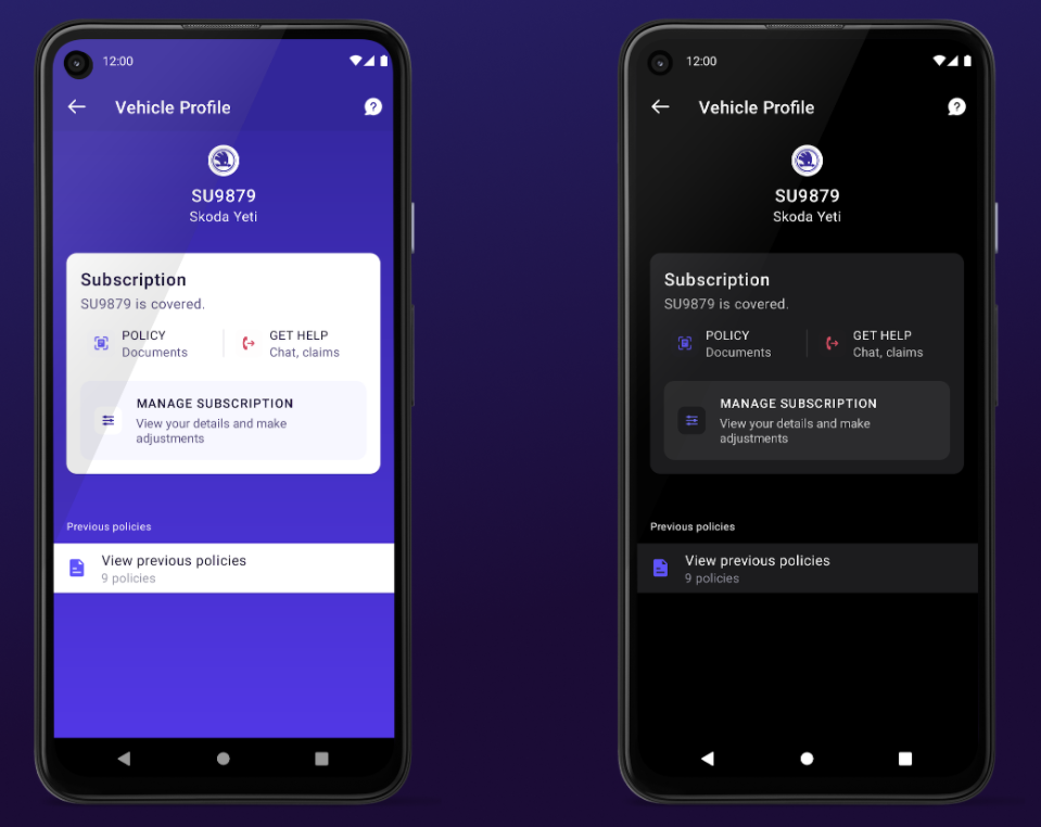
As you can see, both light and dark themes are supported with zero effort on our part. This is a great way to dabble in some Compose and get started replacing small components.
AndroidView
AndroidView is basically the opposite. Once you’ve written more Composables, the next logical step is to write a screen from scratch, or refactor and old one. But you’ll very likely encounter a situation where not every component from your design system has been migrated across, therefore you need a way to inflate a View inside Compose. AndroidView does just that.
@Composable
fun AnExampleScreen(click: () -> Unit) {

    AndroidView(
        viewBlock = ::MyButtonView,
        modifier = Modifier.fillMaxWidth(),
    ) { button ->
        button.text = "Hello world!"
        button.setOnClickListener {
            click()
        }
    }
}
Here, we pass the constructor of MyButtonView as the viewBlock parameter lambda, and Compose handles the rest. We’ve used this technique in a few places as a stand-in while we build Composable replacements, and again it’s pretty much seamless. The Context used to inflate the View comes from the AmbientContext.current, which is the same Context inherited from your Activity or Fragment that the View would normally use. Long story short, this means that you don’t have to worry about passing a theme - again, light or dark theme just works. Locales, configuration changes, all of the stuff you’d expect works perfectly.
It’s worth noting here that the Context means you’re able to grab a LayoutInflator too - you can use it to inflate arbitrary XML layouts containing lots of Views if you so wish.
In this example, the “Learn more” button is a legacy View inside a layout which is otherwise 100% Jetpack Compose. Again, you can see that light and dark theme works great with no special tweaking by us:
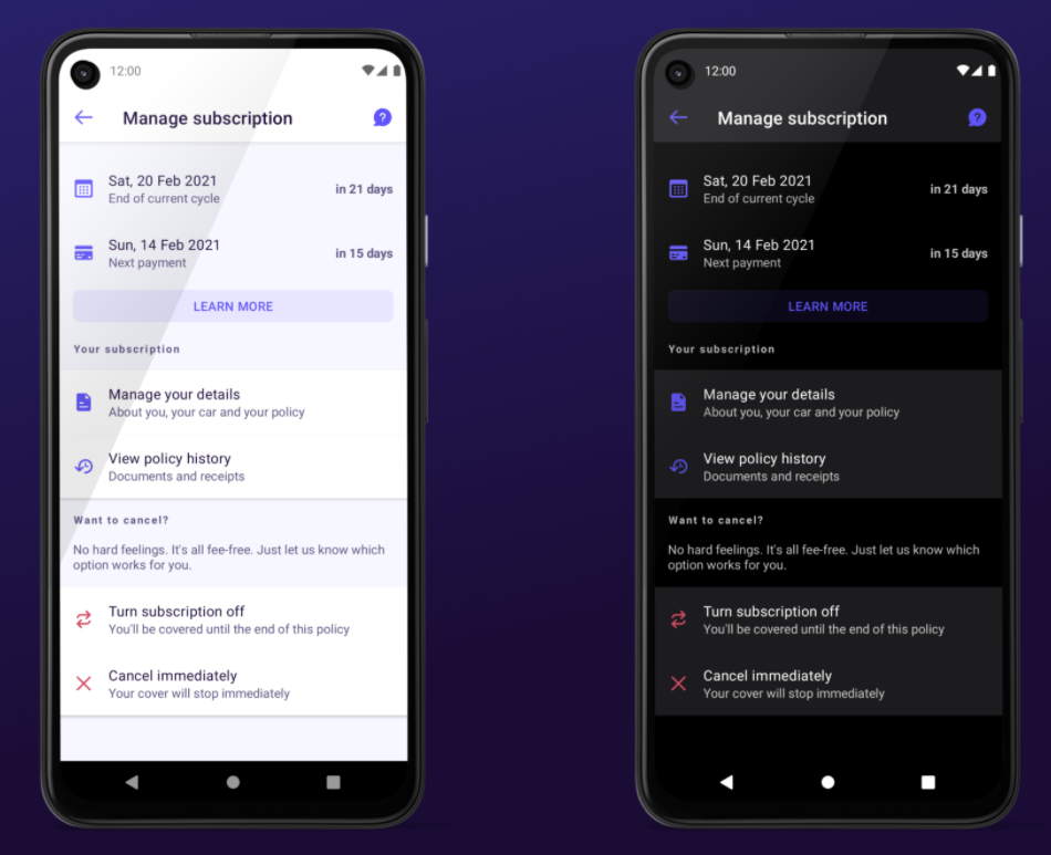
The only slight gotcha we’ve found with this is an annoying one. Our ButtonView is actually a FrameLayout, where at runtime we inflate a MaterialButton inside it with a specific colour depending on some parameters. This means that in XML, the preview is broken. In a normal XML layout, this is generally represented as a blank space, but the Compose previews just straight-up fail to render at all - quite frustrating. This isn’t likely to be a common problem, but one that has caused us a bit of pain.
AndroidViewBinding
Last up is AndroidViewBinding, which is an interesting one - it lets you completely replace an XML layout that uses ViewBinding in one go. We’ve not really found a use for this, but that’s probably because we architected for Compose way in advance of the alpha. I suspect the usecase for this is allowing you to migrate your data flow from your ViewModel first, whilst providing a guarantee that nothing changes in the UI.
@Composable
fun ViewBindingExample() {

    AndroidViewBinding(ExampleBinding::inflate) {
        // Access your binding properties here
    }
}
On the interop
In terms of migration, there’s not one rule and one tool that’s going to work for every situation. However these 3 options have got you covered, and you can summarise their usecases like so:
| Class | Usecase |
|---|---|
| ComposeView | You’ve migrated one View to Compose, and want to dip your toe in the water by inserting it into an existing layout |
| AndroidView | You’ve migrated an entire layout to Compose, but have on or two View classes not yet ported across |
| AndroidViewBinding | You use ViewBinding and want to test/migrate your data flow to support Compose |
If I had to guess, I would argue that Google learnt a valuable lesson about the reasons why Kotlin won in the race for a Java replacement. The main reason, in my opinion, was near-seamless interop. This is much more important than tools which convert legacy to cutting-edge (which many have asked for with Compose) - it allows users who are willing to experiment to dip their toes into a new ecosystem in a way that just works. The interop for Compose is an example of that, and I’m sure that the Compose team spent a lot of time making sure that this experience is faultless. Coming from the world of View where there are tonnes of gotchas and caveats, it’s very impressive work and the team have done a great job.
Testing
When I gave this blog post as a talk originally, I had a slide with the “you wouldn’t download a car” meme with the words:
You wouldn’t refactor legacy code without a test harness
Comedic genius, I know. But it’s true - as developers, when faced with legacy code that we want to refactor into something shiny and new, we generally take the same approach. Perhaps we abstract an interface first, but we typically build a test harness around the class we’re refactoring, verify its current behaviour, and then use this harness to safely refactor knowing that we can prove that we haven’t broken functionality in the process. Why should UI be any different?
This is absolutely possible in Jetpack Compose, both on an individual component basis and on a page-by-page basis. What’s more is Compose makes this simple even for legacy View classes.
Testing Components
For Components, the approach which I’ve found to work the best is using screenshot testing. This in a nutshell is a system whereby you write a test that “records” the View by taking a screenshot, then you refactor as necessary before doing a “compare” run of the test. Under the hood, your screenshot library should compare the two png files and pass if they match, or fail if they don’t. If like us at Cuvva, you have a library of design components already made using the legacy View-based system, this solution gives you a pixel-perfect way of checking that you’ve managed to replicate the old View component in Jetpack Compose and that it responds the same way to all possible states. The best solution for this that I’ve found is called Shot.
Once you’ve gotten Shot configured*, the first thing you’ll want to do is create a test harness around your individual View component. Traditionally this has been rather difficult (I don’t know of any particularly good solutions), but the interop in Jetpack Compose is so good that it provides a simple answer.
Here, we take our legacy MyButtonView, inflate it inside Compose using the AndroidView interop, set the required text and then take a screenshot:
class ComponentTest : ScreenshotTest {

    @get:Rule
    val composeTestRule = createComposeRule()

    @Test
    fun example_test() {
        composeTestRule.setContent {
            MyTheme {
                AndroidView(::MyButtonView) { button ->
                    button.text = "Hello, world!"
                }
            }
        }

        compareScreenshot(composeTestRule)
    }
}
If the component you’re testing requires a theme to be set, there’s a solution for that too:
composeTestRule.setContent {
    AndroidView(
        viewBlock = { context ->
            MyButtonView(
                ContextThemeWrapper(context, R.style.My_App_Theme)
            )
        }
    ) { button ->
        button.text = "Hello, world!"
    }
}
This is fantastic because we no longer need to launch an ActivityScenario or FragmentScenario with a single View just to test a component.
Hilariously, you can even write Espresso assertions here too! Although I personally don’t think these are particularly useful on an individual component unless it has aspects that are visible or not depending on its configuration.
class ComponentTest : ScreenshotTest {

    @get:Rule
    val composeTestRule = createComposeRule()

    @Test
    fun example_test() {
        composeTestRule.setContent {
            MyTheme {
                AndroidView(::MyButtonView) { button ->
                    button.text = "Hello, world!"
                }
            }
        }

        // This works!
        onView(withText("Hello world!")).check(matches(isDisplayed()))

        compareScreenshot(composeTestRule)
    }
}
Once you’ve written this harness around your View, we simply call ./gradlew debugExecuteScreenshotTests -Precord to record a screenshot. This file now becomes the baseline, and you can get to work on replacing it with your new Composable. Once you’ve done this, simply drop it into the test:
class ComponentTest : ScreenshotTest {

    @get:Rule
    val composeTestRule = createComposeRule()

    @Test
    fun example_test() {
        composeTestRule.setContent {
            MyTheme {
                MyButton(text = "Hello, world!")
            }
        }

        compareScreenshot(composeTestRule)
    }
}
On executing, the test runner will take a new screenshot, compare it against the old baseline one from earlier and then either pass, or it’ll create a HTML summary which highlights exactly which parts of the UI differ. If you find this is a little too sensitive, you also have the option of configuring Shot’s accuracy - if you don’t need it exactly pixel-perfect, it doesn’t have to be. What’s nice about this as well is that you can easily find the before and after screenshots in the root of the module you’re testing, which makes opening a PR with visual proof that you haven’t broken anything quite easy.
Should you want to write Espresso-style assertions, you’ll have to (for now) re-write them using the Compose JUnit artifact:
composeTestRule.onNodeWithText("Hello world!").assertIsDisplayed()
As you can see, the syntax is similar enough that this isn’t too complex to do, should you want to. I’ll dig into this in slightly more detail later on.
The final thing which I really like about screenshot testing is it lets you assert that the behaviour of the component under “unusual” conditions matches that of your legacy View, so that you don’t see any unexpected surprises when shipping the app because you’ve only checked the happy path. If you go this route I highly recommend checking both light and dark mode, different locales, very long strings, left-to-right and right-to-left, and any other configurations or permutations you can think of. There probably will be minor differences, but a solution like shot makes them very apparent and you can then take the results back to your design team and check whether they’re okay with the new behaviour vs the existing one.
*Configuration is harder than it should be
Shot requires a fair bit of configuration, and the docs cover it reasonably well with a few little gotchas. I have had an absolute mare of a time getting this up and running correctly even on a small test project - differing Compose versions, mistakes on my part, weird bugs, incompatibility with API 29 + 30 (there’s a even a matrix in the docs that explains this) but I do think what’s on offer is valuable if you have patience. I would however love to see a first-party solution at some point coming from Google.
I also think it’s worth stating that I don’t believe that this sort of test is particularly valuable to leave hanging around your codebase forever. I would perhaps recommend starting with a harness, using that harness whilst creating your component and running the test locally, then sharing the before and after screenshots in your PR whilst deleting the test. It’s entirely up to you though - they could be valuable to ensure that changes to your theme don’t break things in new and unexpected ways, or you could integrate the output into your workflow with your design team.
I’m going to be completely honest here - we didn’t invest as much time in this as we should. Perhaps we would download a car. We’re a small (but growing!) team with a lot of priorities right now and this fell to the wayside a bit, partially due to how much I struggled to get Shot up and running. I would absolutely recommend investing time in this if you have the resources - you’ll make your life a lot easier and sleep better at night.
Testing Screens
Once you’ve created a critical mass of design components using Compose, chances are you’re going to at some point go back to existing screens and convert them over. You could absolutely use screenshot testing here if you wanted to, but this is where more traditional UI testing on Android comes into play.
A “traditional” setup for this style of test inevitably involves launching an Activity or Fragment, and then asserting that certain Views are displayed. For a contrived example:
@RunWith(AndroidJUnit4::class)
class ScreenTestExample {

    @Test
    fun assert_is_displayed() {
        val scenario = launchActivity<MyActivityUnderTest>()

        // Some magic involving changing the ViewModel state

        onView(withText("Hello world!")).check(matches(isDisplayed()))
    }
}
Typically, you might drive the Activity to a new state - checking lifecycle events, rotation, or clicking on a View to trigger an event. In a typical ViewModel-type setup you might also mock the ViewModel to do this driving - maybe testing loading vs no data vs errors vs data. You can also mock further down the stack if you’re making a more integration-style test. This ViewModel mocking I have found be quite painful at times in a Dagger-based setup. Replacing the ViewModelFactory with one specific for testing is the easiest solution.
None of this is necessary with Compose if you’re just testing the UI aspect - although entirely possible if you want to by using createAndroidComposeRule. The setup is really no different from testing an individual Composable:
class ScreenTestExample {

    @get:Rule
    val composeTestRule = createComposeRule()

    @Test
    fun assert_is_displayed() {
        val viewState by mutableStateOf(MyViewState(text = "Hello world!"))

        composeTestRule.setContent {
            MyTheme {
                MyScreenUnderTest(state = viewState)
            }
        }

        composeTestRule.onNodeWithText("Hello world!").assertIsDisplayed()

        viewState = viewState.copy(text = "Howdy partner!")

        composeTestRule.onNodeWithText("Howdy partner!").assertIsDisplayed()
    }
}
As you can see, it’s suddenly very easy to drive the UI into different states and then assert that the UI has reacted accordingly - we simply change a mutable state object.
Whilst it’s still quite early days in the Compose testing world and the API is likely to change, there’s quite a lot on offer here. All of the semantics you’d expect are available - clicking, key events, counting the number of items in lists etc, and the syntax should be familiar enough for those with Espresso experience. You can also print out the entire tree which is handy for debugging. One thing that is absent which I would love to see is being able to assert that a Composable has a specific colour background - perhaps sometime in the future, or perhaps that’s a weekend project for someone in the community.
As ever, Google’s testing doc for Compose has a lot of detail in it and is worth a pour over.
The future of testing
One downside of all this is that you might already have a test suite with a great many Espresso assertions. These will clearly no-longer work and you’ll need to migrate all of your assertions across to the Compose way of asserting on nodes.
However, there is some hope that this won’t be the case for very long. It looks as though Google have thought about this and are working towards Compose support in Espresso, which is brilliant news for established codebases with proper test suites. Simply replace your ActivityScenario with the Compose test rule and you’re largely set, and easily able to verify that you didn’t break some aspect of your UI whilst refactoring.
What this does mean in the short term though is that writing extensive tests for Compose UI is a bit of a conundrum. Do you invest in the Compose assertions, knowing that they’ll probably be deprecated in the future? Or do you ignore testing for now and wait for Espresso support? As ever, these tradeoffs are part and parcel of adopting the cutting edge, and that decision depends on the values that your team lives and develop by.
Rounding up
Ultimately, it’s still early days for Compose in general and especially the testing aspect, although we have a few interesting options already. That being said, the interop aspect is absolutely top-notch, and I’ve yet to find a major issue with it - the Compose team have really knocked this aspect out of the park, and I suspect this was a rather deliberate focus.
Thanks for reading. In part 4 I’ll talk about collecting metrics and keeping stakeholders up to date, string and drawable resources, accessibility, and answer any questions that people have about our experience at Cuvva. If you’ve got any feedback, questions or thoughts, the best place to reach me is on Twitter.